Time to Reality Check the Real Estate Market
Rarely does a day go by that I don’t get asked if this is a good time to buy and/or sell a home. Some people might think that my response is always an emphatic “YES!” because I work in real estate. But in truth, there is no right or wrong answer. Every person’s circumstances are unique, so in some cases the answer might be yes, but for others it might make more sense to wait. Allow me to explain.
The good news is that we’re finally coming out of the housing slump of the past five-plus years. Housing is a major driving factor of the U.S. economy, so regardless of whether or not one owns a home, a stronger housing market is good for everyone. For some would-be home sellers, this positive momentum, combined with a rise in home prices and buyer activity, is enough to compel them to list their home. And right now the statistics appear to be on their side.
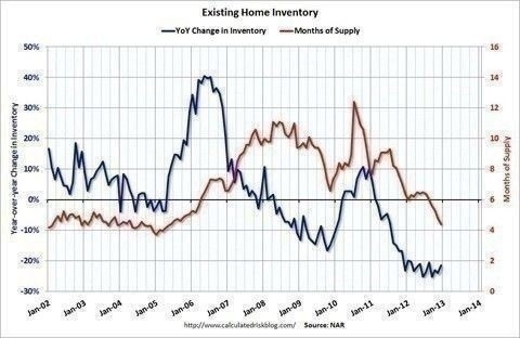
According to the most recent findings from the National Association of REALTORS®, total housing inventory has fallen for the past several months, settling at just under two million existing homes on the market that are available to buyers. This represents about a four-month-supply of homes throughout the U.S. This is the lowest housing supply the nation has seen since May of 2005 – during the peak of the housing boom.
“Months supply” basically means that if existing homes were to continue selling at the current rate, the inventory of homes would be sold by that many months. A “normal” market usually has around six months of supply; therefore lower numbers mean a shortage of inventory. If demand is greater than supply, this often leads to competition amongst buyers – and rising prices – as we’ve seen in many markets throughout the Western U.S.
Here are the current inventory levels in key markets along the West Coast, all of which fall below six months of supply and report strong competition among buyers.
· Seattle: 1.4 months
· Portland: 4.2 months
· San Francisco: 1.8 months
· Las Vegas: 3.8 months
· Palm Springs: 2.5 months
The following graph demonstrates the downward trend in the overall U.S. month’s supply of homes which is currently at about 4.4 months:
 [1]
[1]
So what does this mean for buyers and sellers?
It means as long as inventory levels remain low, competition amongst buyers will remain high, and home prices should continue to steadily rise – albeit at a healthy rate – not like what we saw during the housing boom. As evidence of this, in the recent Home Price Expectation Survey, 105 leading housing analysts called for a 3.1 percent increase in home values by the end of 2013. And in a recent report by the National Association of REALTORS®, median home prices last quarter showed the strongest year-over-year increase in seven years.
Another thing that buyers and sellers need to keep their eye on is interest rates and their impact on affordability. Interest rates have been at such historical lows for so long that it’s easy to take them for granted. But the truth is that several lending institutions, including Freddie Mac and the Mortgage Bankers Association, project that interest rates will rise from 3.4 to 4.4 percent by the end of 2013. A full point increase can have a significant impact on the amount of your mortgage over the long term.
OB Jacobi is the president of Windermere Real Estate.
For more information, visit www.windermere.com
John Marcotte
720-771-9401
Search all Colorado homes for sale
 After running up record debt-to-income ratios during the bubble economy of the 2000s, young adults shed substantially more debt than older adults did during the Great Recession and its immediate aftermath—mainly by virtue of owning fewer houses and cars, according to a new Pew Research Center analysis of Federal Reserve Board and other government data.
 From 2007 to 2010, the median debt of households headed by an adult younger than 35 fell by 29%, compared with a decline of just 8% among households headed by adults ages 35 and older. Also, the share of younger households holding debt of any kind fell to 78%, the lowest level since the government began collecting such data in 1983.
 One way to measure a household’s financial well-being is its debt-to-income ratio, which compares total outstanding debt to annual income. As the figure to the right indicates, the debt-to-income ratio of younger adult households more than doubled from 1983 to 2007, when it peaked at 1.63. By 2010 it had fallen back to 1.46. By contrast, the ratio among older households continued rise through this entire period. As of 2010 it has risen to 1.22, still below that of younger households.
 With regard to other types of debt, older households have shed less than younger households. The prevalence of vehicle debt fell from 32% in 2007 to 30% in 2010 among older households, compared with a 12 percentage point drop among younger households. The share of older households carrying a credit card balance declined from 45% in 2007 to 40% in 2010, while the share among younger households dropped by 10 percentage points.
 Younger and older adults both saw their median household assets – which includes homes, cars and other durable goods, plus all financial assets such as savings accounts and stock holding — decline from 2007 to 2010. Older adults have many times more assets overall than younger adults, and they suffered steeper asset declines during this period – a 22% drop, compared with 14% among younger adults. One reason for the difference is that older adults have more of their assets in financial holdings, and stock market valuations took a steep downturn from 2007 to 2010. Since then, the stock market has regained virtually of all its losses, while the housing market in most of the country has remained well below its historic peak.